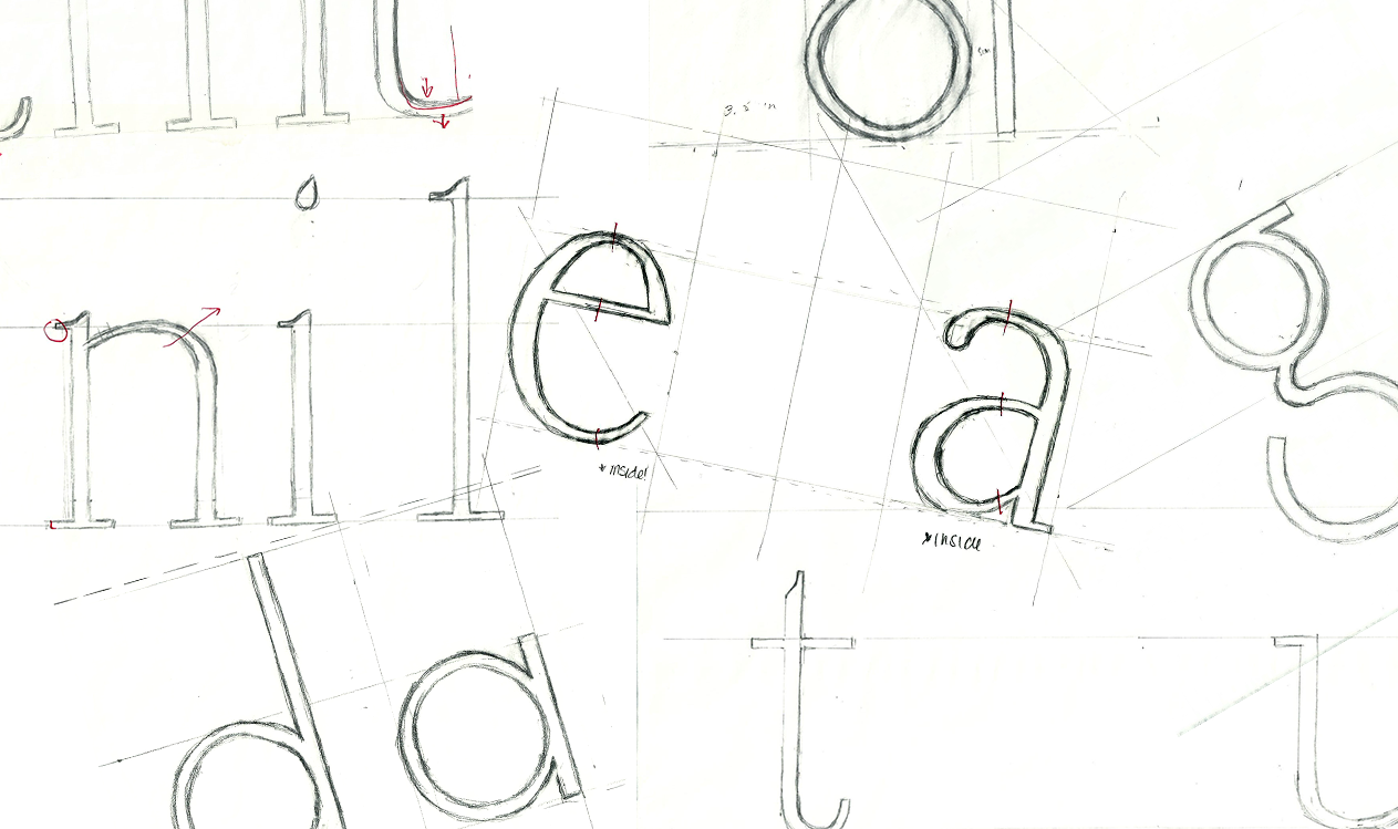
Typeface Design Study
Typeface Design Project for GPHD 130 at CSUS.
Typeface Design: Illuminance and Adagio
CSUS. Spring 2017. GPHD: 130
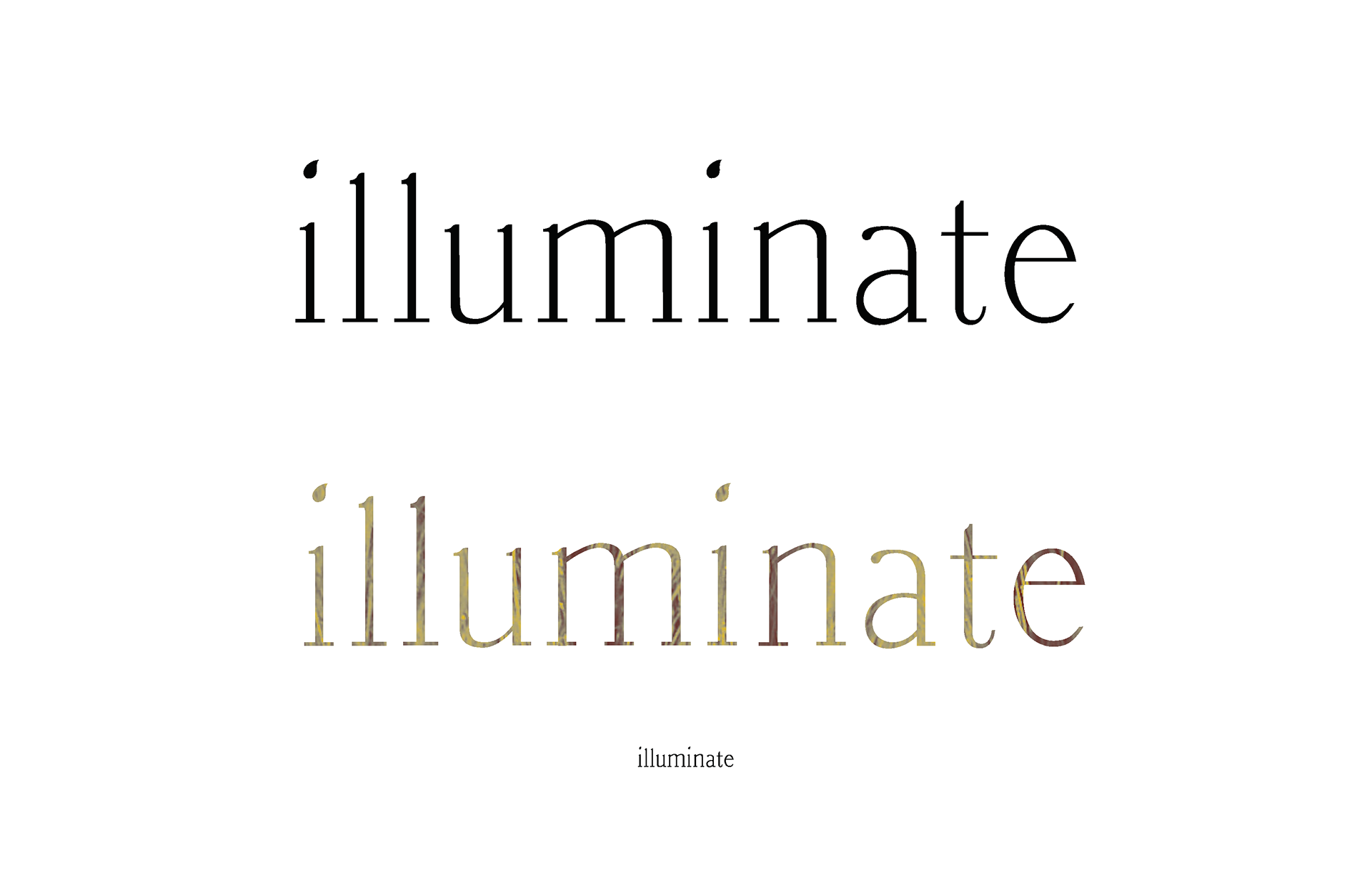
Illuminate is a didone inspired font. I really wanted to use very thin, but high contrast verticle and horizontal widths with this typeface. All of the curvy decorative elements of this typeface are to represent a flickering light, hence the word illuminance.
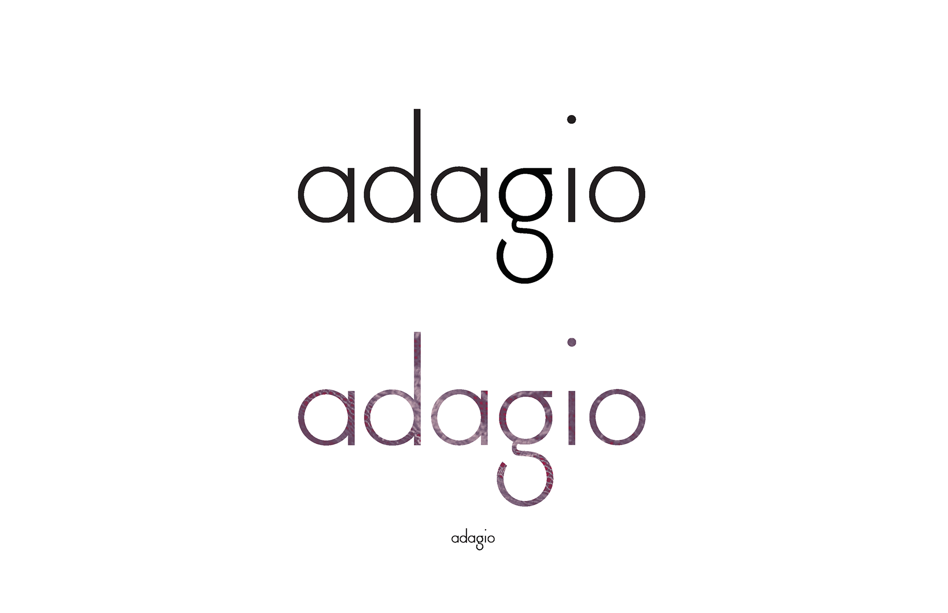
Adagio is a geometric sans serif inspired font. Although it is also a rather lightweight font, there is minimal contrast between the horizontal and verticle widths. I really wanted this typeface to represent the essence of the Adagio movement in classical ballet: slow, sustained movement. The g best represents this concept with its sturdy but smooth movement.
Thank you for viewing!